In 2025, executive leaders in philanthropy are navigating an increasingly complex and fast-moving landscape. Strategic priorities are shifting quickly, community needs are constantly evolving, and boards are now expecting more frequent, data-informed updates.
Yet despite these changes, many foundations still rely on static, year-end reporting to demonstrate progress. This leaves leaders with limited visibility between cycles and little time to course-correct.
But what if those insights didn’t have to wait until year-end? What if your existing grants management system could help you track change as it happens, giving you the clarity to lead with confidence and stay aligned with your mission even as the landscape evolves?
See the Story Earlier: Embedded Dashboards within Grantelligence
That's where integrated business intelligence (BI) tools can help. BI tools transform unprocessed data into visual and actionable insights that enable you to identify trends, measure performance, and uncover areas of deficiency in real time.
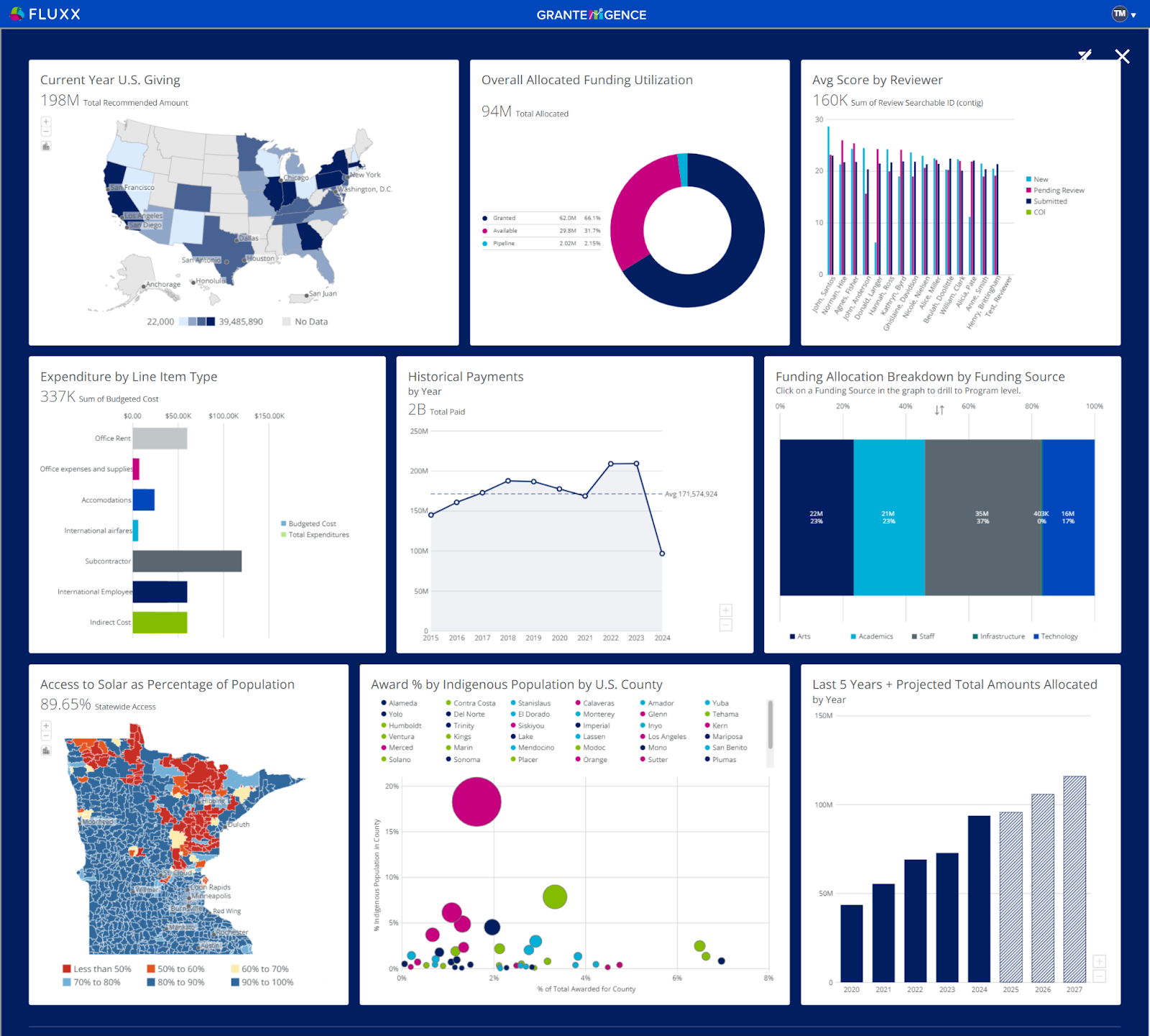
Within Fluxx, that capability is delivered through Grantelligence, a purpose-built BI solution designed specifically for grantmaking. It integrates your operational, financial, and programmatic information into visual dashboards that:
- Update automatically 3x times daily, meaning no more scrambling before board meetings
- Show what’s changed, where, and why it matters
- Align programs, strategy, and governance in one shared view
Unlike traditional BI tools like Tableau or Power BI that often require custom integrations, IT support, and extensive configuration, Grantelligence works natively within your existing grants management system. This eliminates the need to build or maintain separate connections, create custom data models, or develop dashboards from scratch.
The result? A solution that saves you:
- Months of implementation time
- Reduces reliance on analysts
- Delivers immediate value to your team.
What You Could Build: An Executive-Level Impact Dashboard
For foundation leaders ready to move beyond static reports and scattered data, the
Impact Dashboard below is a powerful example of the kind of insight you can create with Grantelligence.
This example dashboard gives executives a clear, high-level view of how grants are advancing mission, strategy, and equity goal all in one place. Instead of chasing numbers across spreadsheets or waiting on monthly rollups, you gain a visual command center tailored to your priorities.
With a dashboard like this, you could:
- Track goal achievement across your portfolio
- Visualize alignment between grants and strategic priorities
- Compare impact by program area, geography, or population served
- Surface bottlenecks or gaps in grantee reporting
The example below reflects key metrics CP1 execs often need at their fingertips:
- Outcome Achievement Rate – Percent of grants that hit their stated goals
- Strategic Goal Alignment – How your funding maps to core organizational objectives
- Impact by Program Area – Comparative performance across focus areas
- Demographic or Geographic Reach – Who is being reached, and where
- Grantee Reporting Compliance – On-time and complete impact reporting
It’s your data, telling your story clearly, credibly, and on your terms.
-1.png)
.png)